
ADA Color Contrast Analyzer
Color Compliance Tool
Test Your Site for ADA Compliance With Fonts and Colors
Are your website and educational tools accessible to those who are sight-challenged? Ninja Tropic’s Color Checker is a free tool that determines if your site is compliant with the Americans with Disabilities Act (ADA) and its regulations related to online materials. This tool determines the contrast ratio between your site’s foreground and background colors, and informs you if this contrast is compliant with ADA guidelines.
Ninja Contrast Checker
Foreground Color
Background Color
Contrast Ratio
Customize your text preview
Font Family:
Font Weight:
Font Size Normal Text:
Font Size Large Text:
Recomended Normal Text: 12pt
WCAG AA: Pass
WCAG AAA: Pass
Recomended Large Text: 14pt
WCAG AA: Pass
WCAG AAA: Pass
Here’s How the Color
Checker Works:
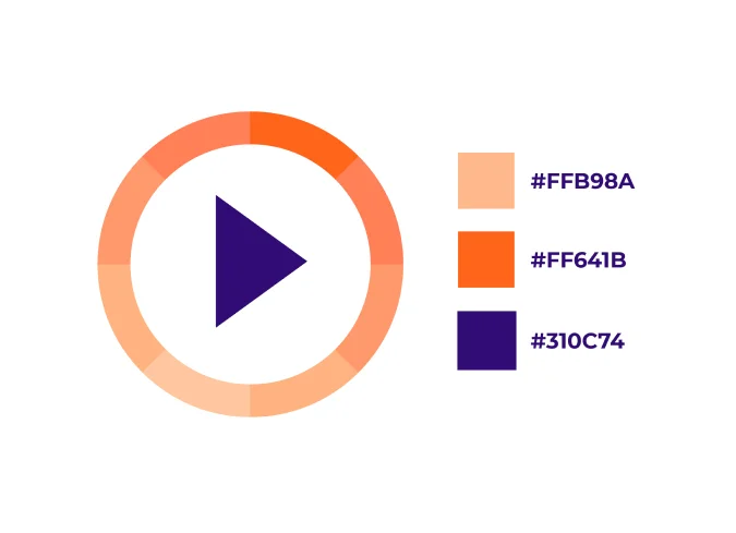
#1 Determine which colors your website/learning materials uses (or will use). The colors are classified using RGB hexadecimal format (for example, #FD3 or #F7DA39).
#2 Select a foreground and background color using the RGB hexadecimal code (or choose a color using the tool’s color picker). To adjust the color, you can use tool’s Lightness slider.
#3 Select your fonts and font sizes.
The Color Checker Will
Then Do the Following:
#1 Generate a Contrast Ratio number.
#2 Demonstrate what your font and color combinations look like.
#3 Inform you if this combination passes the two ADA categories for Web Content Accessibility Guidelines (WCAG AA and WCAG AAA). You can learn more about these categories and their requirements on the Web Accessibility Initiative (WAI) webpage.
Text and captions should meet the standard contrast ratio of 4.5:1 or greater.* Learn more on the Web Accessibility Initiative (WAI) webpage explaining what contrast ratio checker results mean.
How did you do? If your combination is not compliant, then you can continue adjusting the colors and fonts until the tool indicates that you have created a combination that is acceptable. Use these fonts and colors on your next website or for your online learning materials.
Benefits of the ADA Color Checker Tool
Why use the tool checker? ADA and WCAG compliance offers the following:

#1. Proof of Commitment to an Important Cause
By demonstrating your commitment to inclusive online learning materials, you are providing a compassionate support to an appreciative group of sight-challenged learners. Groups who benefit from this include those who are color blind, have a limited color range, or have moderately low vision.
#2. Reach a Broader Audience
It goes without saying that your online learning materials should be easy for everyone to read! Making your learning content easy to digest in turn makes it easier for students to absorb and comprehend their educational materials. Put students first by taking the time to create curriculum they can easily read.
#3. A Modern Approach
In the corporate and academic worlds, distance learning continues to grow in popularity. ADA compliant fonts and colors ensure that your institution is up to date with online learning and design.
Learn more about ADA color compliance with the following resources:
References:
WCAG Color Contrast Checker
UNDERSTANDING – WCAG20
* For quick reference: WCAG 2.0 level AA requires a minimum contrast ratio of 4.5:1 for normal text and 3:1 for large text. WCAG 2.1 requires a minimum contrast ratio of 3:1 for graphics and user interface components (for example, form input borders). WCAG Level AAA requires a minimum contrast ratio of 7:1 for normal text and 4.5:1 for large text.
Get a FREE
Consultation
With Ninja Tropic!
Are you aware of the sheer power of engaging eLearning solutions but not sure where to start? Schedule a free 30-minute consultation with a Ninja Tropic eLearning expert to analyze your organization’s content objectives and map out the interactive blueprint to achieve them.
